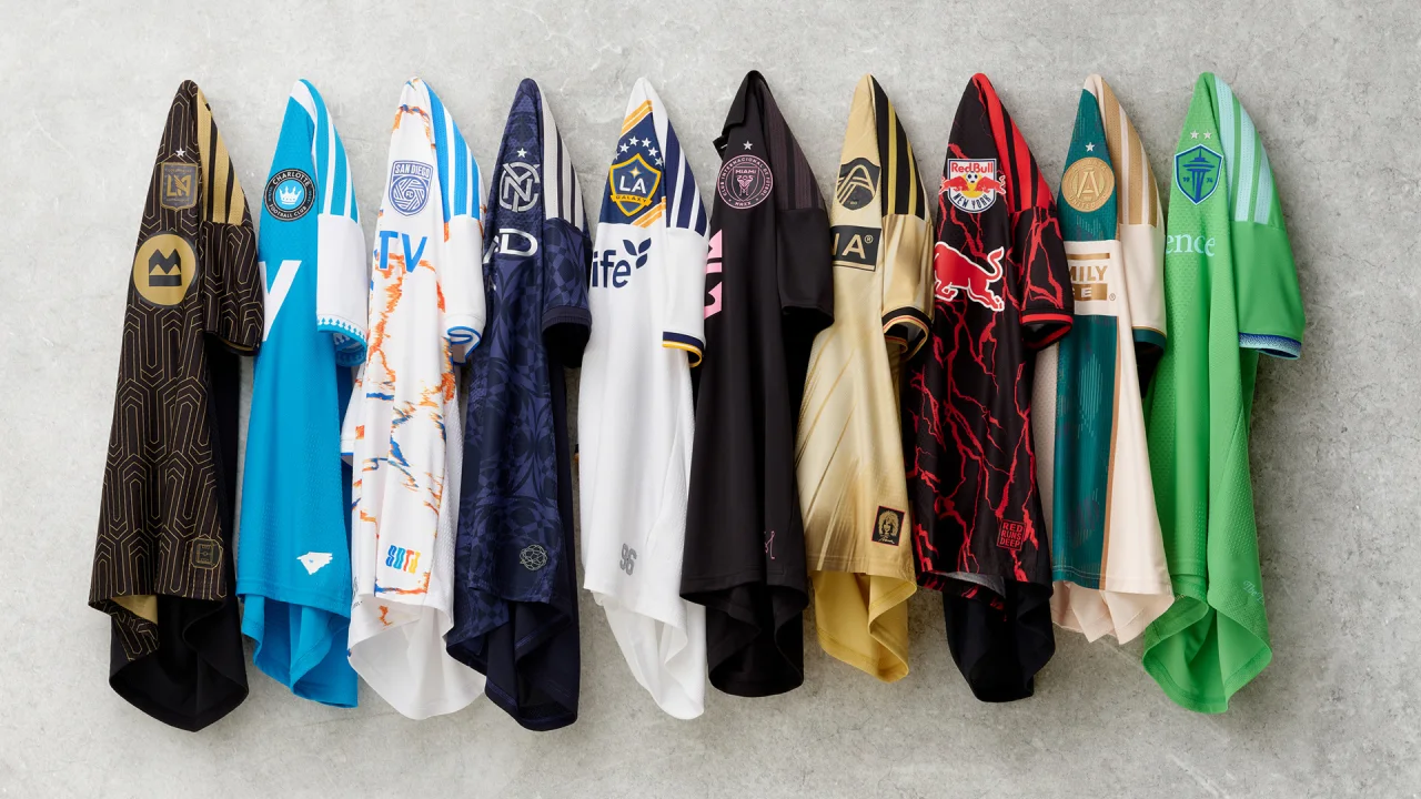
The 2026/27 MLS season is starting soon and with it some big players are making their return while others are making their debut. It’s an unpredictable sport with so many factors leading to goals, fouls, trophies wins and defeats. Whoever the player or team is that you are watching this season, the kit they do it in will be the most looked at part. All 30 have officially released. Some teams are staying true to their route with the old “if it ain’t broke don’t fix it” motto. While some are trying to branch out from their normal color scheme or patterns and testing their limits. While some who do this are major hits others, well let’s just say the risk ain’t always worth the reward.
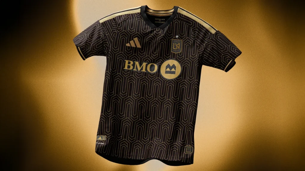
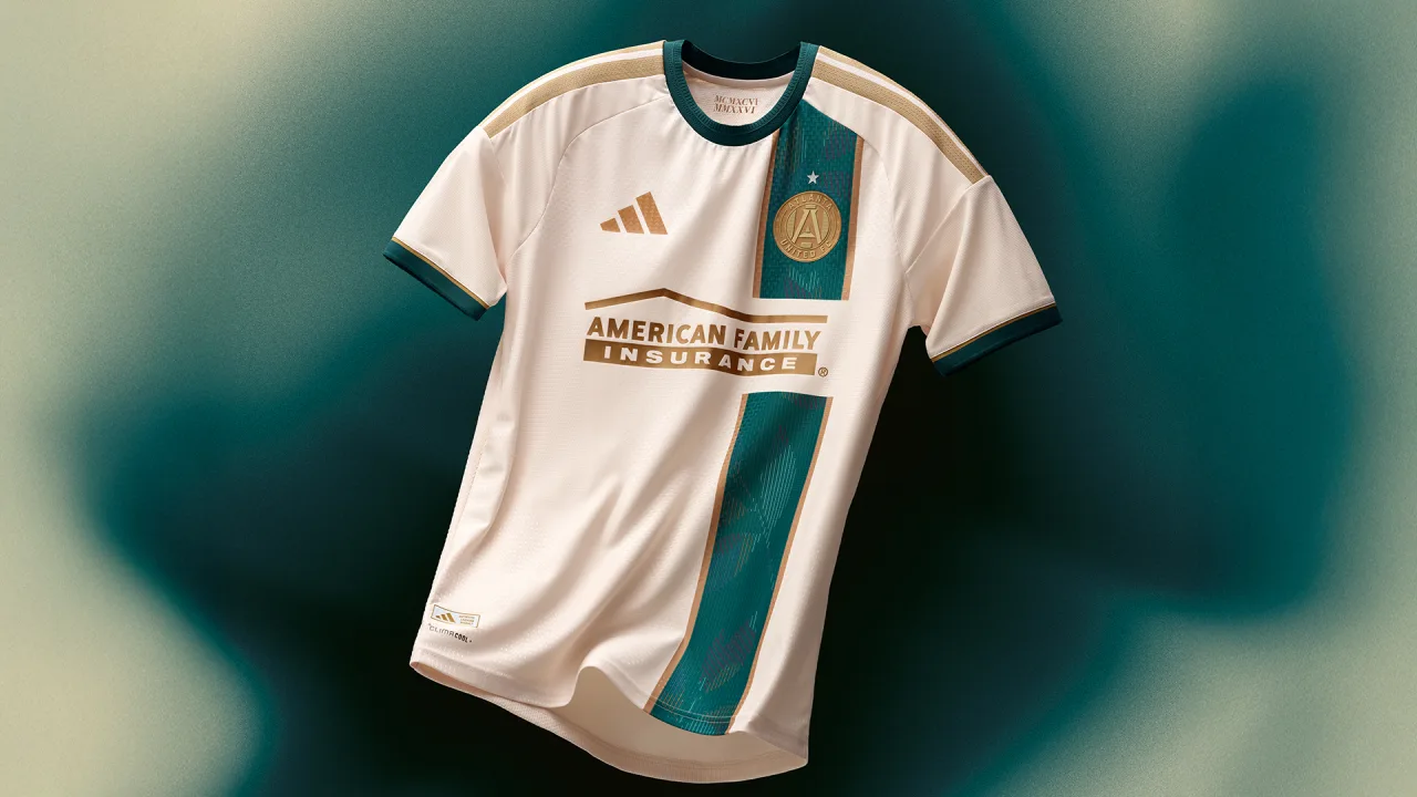
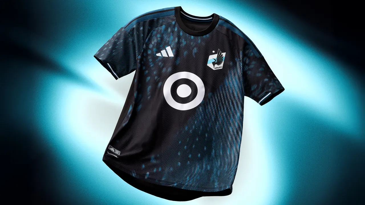
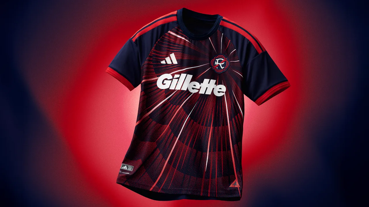
THE GOOD: LAFC, New England Revolution, Minnesota United FC, Atlanta United
These 4 stuck out the most to me in terms of “wow” Factor. The colors, the patterns and the ideas behind the style. Atlanta however, to me, really went all out in such a creative way with paying homage to the 1996 Atlanta Olympics. New England was one that also stuck out in my eyes because in previous seasons they usually are pretty basic in terms of design. They just are not too much or not too little but this season they tried and in my opinion succeeded. May have to buy one this year. LAFC’s jersey just yells LA lifestyle, its got that weird abstract pattern art style that feels like if it was on a painting would go for 5 million dollars because one celebrity posted a pic of it. I like the pattern though it is something Ive never seen on a jersey and it goes very well with the black and gold.
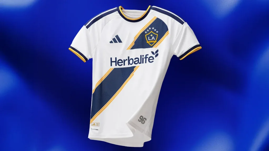
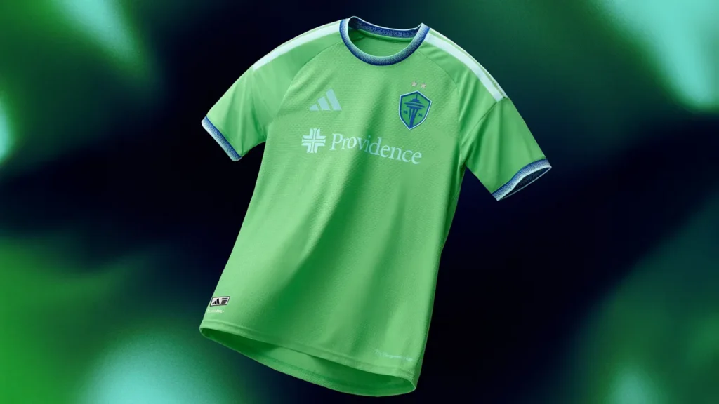
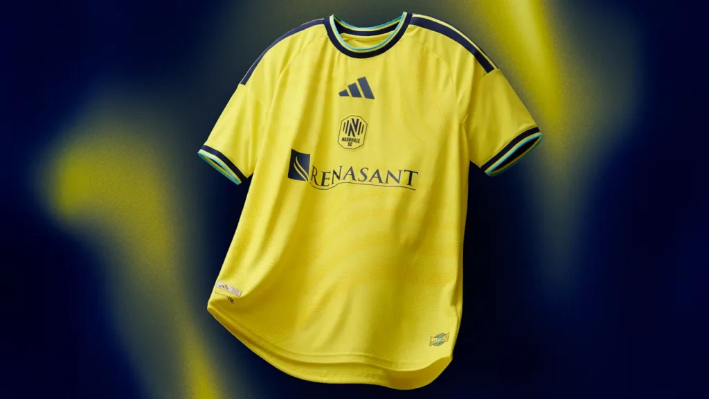
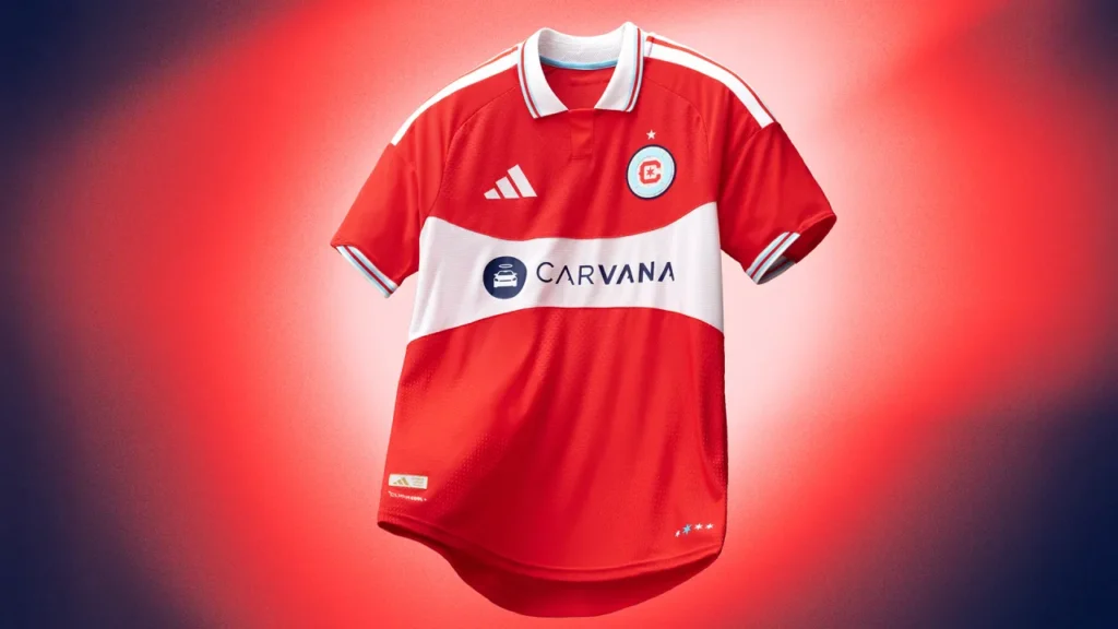
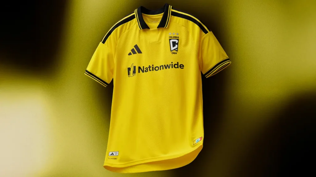
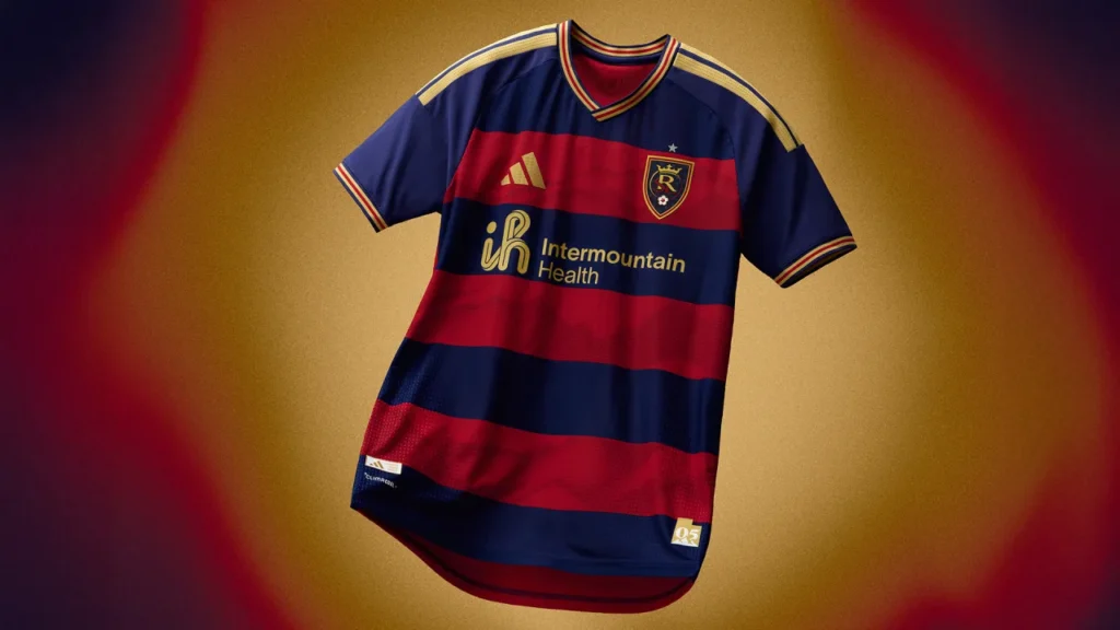
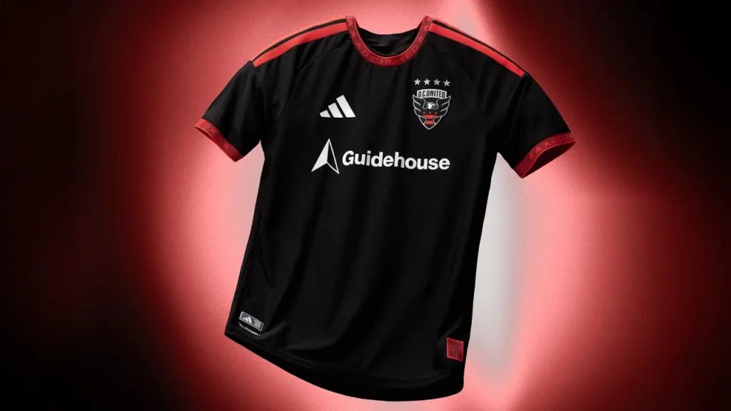
THE BAD: LA galaxy, DC United, Real Salt Lake, Columbus Crew, Chicago Fire, Nashville SC, Seattle Sounders
These are all collectively boring to me. There’s nothing wrong with a solid color kit believe me but take Seattle for example going from the pinstripes to just a solid color green is a step backwards. I mean the design and idea were perfect for last years kits. I don’t know who back at the design team thought “let’s take this really cool thing and never do it again” but you could’ve played with the pin stripe patterns in so many ways. Make them wavy or different colors but no you just completely got rid of them. As for LA Galaxy, I understand you are one of the oldest teams in the MLS, you got a lot of trophies and star players old and new. You make Bold moves and are a flashy team. So why has your jersey barely changed in the 30 years you’ve been around? DC United, Chicago and Columbus that goes for you too. At least Nashville moved the logos and added a very faint orange fade in the mix. Still bad though.
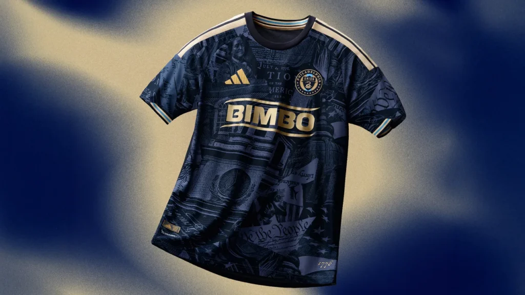
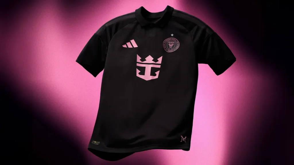
COULD USE IMPROVEMENT: Philadelphia Union, Inter Miami, Austin FC
Philly I love your city so much thank you for taking a risk but in a historical way. It’s not bad (way better than a few of the previous kits you’ve made) so I am gonna give you props for that but it looks like you went to Google images, typed in the search bar “5th grade American history”, downloaded the first 5 things you saw and slapped them on the jersey. It’s faded sure but cluttered. You are the city of brotherly love and a very artsy city as well with so much culture. USE IT! Miami just because you have one of the greatest soccer players on the planet doesn’t mean you have to do so little on your jerseys. The raised look and feel is cool but like come on live a little! Austin no real critiques but I feel like the stripes look good but the colors are too close too each other for my liking plus the way they connect on the shoulders and underarm are weird and I really think this could be the baseline for future kits for y’all.
All photos courtesy of the MLS